New Concepts

.:taymaz:.

مدیر انجمن‌ها
And the RIBA winners are…

[LTR]
he RIBA winners are…
10064_RIBA%20Nat%20main.jpg
Am Kupfergraben 10 Berlin, Germany by David Chipperfield Architects
Amsterdam Bijlmer Arena Station Amsterdam, Netherlands by Grimshaw/ARCADIS Architecten
BMW Welt Event, Exhibition and Automobile Delivery Centre Munich, Germany by Coop Himmelb(l)au, Wolf D Prix, W. Dreibholz & Partner ZT GmbH
Carabanchel Social Housing Barcelona, Spain by Foreign Office Architects
Empire Riverside Hotel & Brauhaus Hamburg, Germany by David Chipperfield Architects
Lufthansa Aviation Center Frankfurt a.M Frankfurt, Germany by Ingenhoven Architects
Nord Park Cable Railway Austria by Zaha Hadid Architects
The Royal Playhouse Copenhagen, Denmark by Lundgaard & Tranberg Arkitektfirma
The Sleeping Giant Co.Dublin, Ireland by O'Donnell + Tuomey Architects
University of Limerick Limerick, Ireland by Wilkinson Eyre Architects
wol_error.gif
اندازه ی اين عكس تغيير داده شده است. برای ديدن كامل عكس اينجا را كليك كنيد. اندازه ی عكس اصلی 1000x751 است.
10064_1_RIBA%20nat%20big%201.jpg
wol_error.gif
اندازه ی اين عكس تغيير داده شده است. برای ديدن كامل عكس اينجا را كليك كنيد. اندازه ی عكس اصلی 1000x722 است.
10064_2_RIBA%20Nat%20big%202.jpg
wol_error.gif
اندازه ی اين عكس تغيير داده شده است. برای ديدن كامل عكس اينجا را كليك كنيد. اندازه ی عكس اصلی 1000x1334 است.
10064_3_RIBA%20Nat%20big%203.jpg
wol_error.gif
اندازه ی اين عكس تغيير داده شده است. برای ديدن كامل عكس اينجا را كليك كنيد. اندازه ی عكس اصلی 1000x761 است.
10064_4_RIBA%20Nat%20big%204.jpg
wol_error.gif
اندازه ی اين عكس تغيير داده شده است. برای ديدن كامل عكس اينجا را كليك كنيد. اندازه ی عكس اصلی 1000x675 است.
10064_5_RIBA%20Nat%20big%205.jpg
wol_error.gif
اندازه ی اين عكس تغيير داده شده است. برای ديدن كامل عكس اينجا را كليك كنيد. اندازه ی عكس اصلی 1000x777 است.
10064_6_RIBA%20nat%20big%207.jpg
__________________


[/LTR]
 

.:taymaz:.

مدیر انجمن‌ها
Sharp lines from Arkenfield

[LTR]
Sharp lines from Arkenfield
10040_385%20arkenfeld.jpg
New admin and training facility for School of Medicine.

Our brief was to design and deliver a building to house the administration and training facilities for the University of Queensland’s School of Medicine, Rural Clinical Division, South East Queensland Region. The Division focuses on encouraging medical practitioners to take up rural practice through providing positive clinical education and training experiences for medical students in rural areas.
The site is located at the north western corner of the Toowoomba Base Hospital at 152 West Street. The site, which was originally a house block, is flanked on the north by a motel and by the hospital grounds on the south and east boundaries. The new facility is pushed to the rear of the site to create a buffer to the bustle of West Street and to accommodate on site car parking.
The building plan form is lean dictated by the limitation of the site and program. The building shuts down to the East and West by means a series of insitu concrete walls and opens up its long north and south sides with the use of full height glass curtain walling.
The approach to the entry is via a sheltered walkway on the southern boundary flanking the green open space. Entry to the building is via a centrally located double height volume.
The building by way of the brief is broken into 2 components. Training and Administration, with the ground floor accommodating all of the student training and support facilities whilst the first floor accommodates all of the administration facilities.
Rooms are all accessed via a centrally located open ended corridor which has high level windows along its entire length to bring in north light.
The East and West Facades are formed up in insitu white off form concrete. These walls have a series of perforations which increase in density and size across the façade to emphasis the entry. The perforations, which are structurally glazed when they fall within the internal volume, animate the façade both internal and external as a result of changing light conditions.
These blade walls are repeated within the double height entry foyer providing animation and texture to the space. The North and South facades are clad in full height structurally glazed curtain walling. This allows winter sun to penetrate the building and enables great outlooks and views to the north over the suburban district and to the south over the hospital grounds further encouraging the integration with the hospital and creating a pleasant working and training environment.
wol_error.gif
اندازه ی اين عكس تغيير داده شده است. برای ديدن كامل عكس اينجا را كليك كنيد. اندازه ی عكس اصلی 1000x1176 است.
10040_1_UQ%20RCD-050%20%28Scott%20Burrows%29.jpg


7c6d.jpg
wol_error.gif
اندازه ی اين عكس تغيير داده شده است. برای ديدن كامل عكس اينجا را كليك كنيد. اندازه ی عكس اصلی 1000x1250 است.
10040_2_UQ-RCD-017-%28Scott-Burrows%29.jpg
wol_error.gif
اندازه ی اين عكس تغيير داده شده است. برای ديدن كامل عكس اينجا را كليك كنيد. اندازه ی عكس اصلی 1000x1250 است.
10040_3_UQ-RCD-029-%28Scott-Burrows%29.jpg
wol_error.gif
اندازه ی اين عكس تغيير داده شده است. برای ديدن كامل عكس اينجا را كليك كنيد. اندازه ی عكس اصلی 1000x713 است.
10040_4_UQ-RCD-073-%28Scott-Burrows%29.jpg
wol_error.gif
اندازه ی اين عكس تغيير داده شده است. برای ديدن كامل عكس اينجا را كليك كنيد. اندازه ی عكس اصلی 1000x800 است.
10040_5_UQ%20RCD-036%20%28Scott%20Burrows%29.jpg

__________________

[/LTR]
 

.:taymaz:.

مدیر انجمن‌ها
Phaeno Science Center Wolfsburg, Germany

[LTR]
1phanoe.jpg


2phanoe.jpg


3phaeno.jpg


4phaeno.jpg


7phaeno.jpg


8phaeno.jpg


9phaeno.jpg


11phaeno.jpg


13phaeno.jpg


12phaeno.jpg


15phaeno.jpg


16phaeno.jpg


17phaeno.jpg


19phaeno.jpg


20phaeno.jpg


21phaeno.jpg
[/LTR]
 

.:taymaz:.

مدیر انجمن‌ها
Central Building - BMW Plant Leipzig, Germany


1bmw.jpg


2bmw.jpg


3bmw.jpg


4bmw.jpg


6bmw.jpg


7bmw.jpg


8bmw.jpg


10bmw.jpg


11bmw.jpg


12bmw.jpg


EuskoTren Headquarters
Durango, Spain

1.EuskoTren.jpg


2.EuskoTren.jpg

High Speed Station
Napoli Afragola
Italy

1.Hadid.jpg


2.Hadid.jpg


3.Hadid.jpg

Central Building - BMW Plant
Leipzig, Germany


Photo-3.jpg


Photo-4.jpg


[
Photo-5.jpg


6.Site-Plan.jpg
 

.:taymaz:.

مدیر انجمن‌ها
Bergisel Ski Jump 2002
Bergisel Mountain, Austria

Skijump-Photo-1.jpg


Skijump-Photo-2.jpg


Skijump-Photo-3.jpg


Skijump-Photo-5.jpg


Temporary Guggenheim Museum
Tokyo, Japan

1.1030_CI_01.jpg


2.1030_CI_03.jpg


3.1030_SK_01.jpg


4.1030_CI_02.jpg


5.1030_M_01.jpg


MAK, Vienna
1.-Hadid.jpg


2.-hadid.jpg


3.Hadid.jpg


4.Hadid.jpg


6.Hadid.jpg


7.Hadid.jpg

__________________
 

.:taymaz:.

مدیر انجمن‌ها
Amazing Residential Tower.....

[LTR]
squreffp-facade-detail-with.jpg
Construction has begun on a 20-story residential tower on 5 Franklin Place in New York designed by Dutch architect Ben van Berkel of UNStudio.​
tri_2_hero-from-northeast.jpg
The exterior will be wrapped in black metal bands which will form balconies, terraces and sunshades. These bands will also frame views from inside the apartments and provide privacy for inhabitants.​
tri_1_franklin-place-approa.jpg
The building will contain 55 apartments ranging in size from approximately 1,200 square feet to approximately 3,400 square feet. There will be three types of home: the loft residences on the lower floors, city residences above and three sky penthouses. Fixtures for kitchens and bathrooms have been designed by van Berkel and manufactured by B&B Italia.​
franklinplace5-additional_i.jpg
The building is UNStudio’s first major project in America.​
All renderings by Archpartners.
Here’s some information from UNStudio, followed by an interview between Raul Barreneche and Ben van Berkel:​
–​
In 1998, Dutch architect Ben van Berkel, co-founder of UNStudio, Amsterdam, captured the imaginations of design cognoscenti around the world with the Möbius House, a remarkable private residence in Het Gooi, the Netherlands. Nestled on a sylvan site northeast of Amsterdam, the Möbius House gave physical expression to the fluctuating domesticity of modern life in an endlessly looping form of concrete and glass, containing luminous interiors where interlocking private and public areas defied all previous convention. With the Möbius House, van Berkel illustrated his belief that things evolve and change – both architecture and family life are elastic – and that orthodoxies exist to be challenged, including the increasingly stale tropes of glass-sheathed, square box Modernism.​
bvb5.jpg
Featured in the landmark 1999 exhibition The Un-Private House at The Museum of Modern Art in New York City, the Möbius House was soon followed by a spate of ever more daring museums, university buildings, corporate structures, residences and industrial design projects that established Ben van Berkel as one of the most significant and critically acclaimed architects of his generation – a designer who embodies what mid-century Italian architect Ernesto Rogers exalted as “designing from the spoon to the city,” connecting public and private worlds.​
bvb3.jpg
In conjunction with the 10th anniversary of the completion of the Möbius House, construction has begun in New York City on Ben van Berkel’s latest, most ambitious and beautiful re-interpretation of standard domestic architecture: Five Franklin Place, UNStudio’s first major American project, will be a 20-story residential tower on Franklin Place, an original 19th century cobbled passageway that runs parallel to Broadway and connects Franklin and White Streets in the Tribeca historic district of Downtown Manhattan. The building will be wrapped in an optically dazzling, constantly shifting pattern of horizontal black metal bands sewn onto its form the way decorative seams and pleats are sewn onto a luxurious couture garment. A direct homage to the applied metal façade decoration of Tribeca’s celebrated 19th century cast iron architecture, these gleaming reflective ribbons will grow thinner and thicker, wrapping the entire tower and moving softly around corners to give the whole structure an etched effect and curvilinear softness, while reflecting the evolving light of day, the clouds and the colours of the city in one of the most dramatic compositions attempted in modern Manhattan’s recent building boom.​
bvb2.jpg
Van Berkel’s highly decorative architectural garment is no mere graphic conceit: Thanks to strategic twisting and torquing, his facade bands will serve as essential functional elements of the tower as well, transforming into balconies for more than half of the building’s residences, terraces for the penthouses at the top, and sunshades that deflect heat and protect all of the structure’s interiors from excess sunlight. These iconic metal bands will serve to also frame panoramic views from inside the building’s residences and insure a level of intimacy and privacy at Five Franklin Place that would be impossible to achieve in a transparent glass facade building.​
sketchesasgroup.jpg
Sketches by Ben van Berkel, Courtesy UNStudio, Amsterdam​
Equally important, the exterior geometries of Five Franklin Place will relate directly to the building’s interiors, which will balance high glamour and cutting edge technology with a distinct atmosphere of warmth. The horizontal and mutable qualities of van Berkel’s facade bands have been brought inside and translated into broad horizontal spatial arrangements; carefully placed curved walls that echo the soft corners of the ribbons outside and shift to allow for maximum flexibility in the use of rooms; balconies shaped to loop residents’ movements back indoors; and highly-engineered, custom features and fixtures for kitchens and bathrooms designed by van Berkel and fabricated by renowned design manufacturer B&B Italia, to echo the shapes formed by the elegant facade treatment. Every interior element has been conceived to maximize light and the exceptional views – bathrooms for example, will have circular sliding doors so that baths can become part of bedrooms and share the same views – and to introduce an alternative to the now standardized rectilinear interiors of contemporary condominium architecture in New York City.​
tri_4_facade-detail-i.jpg
Containing 55 residences in three distinct zones, Five Franklin Place will stand on the frontier of the Tribeca historic district, which is today considered one of the world’s most coveted addresses, in close proximity to such dynamic and desired neighborhoods as Soho, the West Village, the Financial District, Chinatown, and the bustling Lower East Side.​
ffp-facade-detail-with-balc.jpg


__________________[/LTR]
 

.:taymaz:.

مدیر انجمن‌ها
continued

[LTR]
The homes within Five Franklin Place will range in size from approximately 1,200 square feet to approximately 3,400 square feet, and will include one-, two-, three- and four-bedroom apartments configured as duplex lofts or single-level homes, as well as three soaring duplex penthouses with interior elevators and rooftop terraces. Prices for the properties at Five Franklin Place will range from $2 million to $16 million.​
rooftri_19_sky-outdoor-spac.jpg
Five Franklin Place has been developed by David Kislin and Leo Tsimmer, principals of Sleepy Hudson LLC, which in 2007 completed construction of the elegant High Line 519 in West Chelsea. General contractor for the Five Franklin Place is Leeds United Construction LLC. Exclusive sales and marketing agent for the project is Corcoran Sunshine Marketing Group.​
Following images: loft residences​
bvbloft-appts1.jpg
“It seems fitting that Ben van Berkel’s first major American building will be completed at the moment when New York City celebrates the 400th anniversary of the original Dutch settlement of Manhattan,” commented the partners of Sleepy Hudson. “Ben has a pioneering, daring spirit, a global vision that we share. With Five Franklin Place, our entire team aspires to celebrate the art of building, to translate Ben’s vision into a perfect local expression, and to prove that the sublime and the practical can exist side by side in a perfect place to live.”​
tri_07loft-entry-6a_01.jpg
The Building: Loft Residences, City Residences, Sky Penthouses Residents of Five Franklin Place will enter the building on Franklin Place, a narrow, cobbled north-south lane once known as Sugar Loaf Alley, the heart of New York City’s 19th century sugar trade. Newly restored with period lighting, cleaned and re-pointed pavers, and lush vertical plantings, this historic passageway will offer an atmosphere evocative of Old New York and Tribeca’s great past. Beyond a pair of silent, electronically controlled sliding doors and a climate controlled vestibule, the lobby of Five Franklin Place – overseen by a 24-hour doorman and an attendant offering valet parking service – will unfold as a distinctly sculptural but serene, softly lit environment of curving white lacquer fixtures, including built-in leather seating areas and a sparkling violet glass-chip floor. A sweeping curved stairwell will lead from the lobby to a sub-grade level private spa and fitness center. Custom designed by UNStudio and engineered by B&B Italia, this area offers residents a daylight flooded double-height weight room, a wet spa with mosaic tiled steam pavilion and sauna, and a mirrored multi-purpose room for yoga, pilates and stretching, all with towel and water service.​
bvbloftappts3.jpg
In discussing UNStudio’s priorities for Five Franklin Place, Ben van Berkel recently explained, “The building sits at the edge of the Tribeca Historic District, so that low lying structures fan out beneath it to the west and create amazing vistas. At the same time, the site sits squarely between two existing buildings, with the challenges this implies in an urban setting. Exploiting the light and views to the maximum extent was our priority. We started with the purpose and the program of any building: How will the users experience it, what will it be like to live and work and play inside?”​
bvbloftappts2.jpg
Van Berkel and UNStudio answered these questions by conceiving Five Franklin Place as a tower in three portions. For each zone, the architects chose different color schemes and material palettes related to the amount of natural light that can be accessed in apartments at various levels of the building, attempting to work with that natural light and complement it, but not necessarily in expected ways.​
bvbloftappts4.jpg
According to the architect, “On the lower floors where there is a need to maximize daylight, we have specified the lightest-coloured floors and fixtures and wall colors throughout. On middle floors where there is more daylight because the residences are above adjacent buildings, we have a more cream-colored palette, softer because there is more natural light and less need to push for its reflection into the homes. And on the top levels of the building, where there is very abundant light, we have used richer, deeper colors and finishes in a very luxe way.”​
Following images: city residences​
bvbcityappts1.jpg
The lower part of Five Franklin Place is framed between neighboring buildings on two sides, north and south. On these floors – floors 2 through 7 – van Berkel created Loft Residences with 20’ double height living rooms and floating upper level mezzanines configured to bring daylight deep into the apartments. Whereas New York loft mezzanines are typically fixed at one end of an apartment, generating a tunnel effect that leaves a portion of the home very dark, UNStudio made a seemingly simple but radical move by shifting the mezzanines of the Loft Residences to the centre of the floor plan.​
bvbcityappts2.jpg
Each Loft Residence at Five Franklin place also enjoys a large vault with a soaring integral wall that turns from the kitchen into a library. The palette of finishes in these homes is pale, light and reflective, all to boost illumination into the entire home, including the large bathrooms and bedrooms as well as common spaces.​
tri_13b_loftcity-master-bat.jpg
The City Residences on the middle floors of Five Franklin Place – floors 8 through 18 – are characterized by 270 degree views and generous floor plans with expansive paved terraces on the east and west sides of the building. Inspired by the gracious entry foyers of New York’s great pre-War apartments, van Berkel worked to create an equally graceful 21st century interpretation: In every City Residence a custom wall panel frames the lacquered gallery foyer, creating a special space for art, and rooms unfold to flow into one another. As with the rest of the building, fixtures and finishes in this zone were developed with eye toward luxury and comfort, with baths sporting sliding glass tambour doors so that residents can adjust levels of privacy to be completely alone or to open their bathing space to views in rooms beyond.​
bvbcityappts4.jpg
The three Sky Penthouses at the top of Five Franklin Place have spectacular panoramic views of the Manhattan’s West Side to the Hudson River. Veritable houses in the sky, these homes are graced with an interior, cylindrical glass elevator wrapped by a curved, cantilevered floating staircase; operating fireplaces; master baths with panoramic views; and expansive ipe wood and travertine slab terraces with outdoor Sky Spas and entertaining areas.​
bvbcityappts3.jpg
Throughout all three zones of Five Franklin Place, residents will enjoy generously proportioned environments with meticulously conceived technological elements that bring the convenience of an iPod into the broader home experience. Key details range from computerized light level controls to carefully conceived adjustable windows and doors.​
Following images: sky penthouses​
bvbskypenthouse1.jpg
The B&B Italia Collaboration
Throughout Five Franklin Place, kitchens, baths, cabinetry and woodworking designed by Ben van Berkel and UNStudio will exhibit a level of innovation and master craftsmanship rarely seen in New York City condominium developments. This degree of excellence has been guaranteed by an intensive collaboration between the architects and the Contract Division of B&B Italia, one of Europe’s most admired design manufacturers.​
tri_17_sky-kitchen-pha.jpg
Sleepy Hudson brought B&B to the Five Franklin Place project to ensure the highest level of engineering expertise in achieving very precise and challenging original designs conceived exclusively for the building by its architect. Among these are bathrooms that qualify as text book studies in luxury customization, with continuous, built-in curvilinear components and sliding circular doors that allow residents to adjust levels of privacy on different occasions; custom closet systems with integrated drawers and partitioned hanging areas; fitness area features that include luxurious and somewhat avant garde interpretations of standard gym and spa components; and kitchens that, in the words of van Berkel, “don’t really look like kitchens,” with dynamic, thermoformed Corian and metal islands with flying fireplaces; master baths with panoramic views; and expansive ipe wood and travertine slab terraces with outdoor Sky Spas and entertaining areas.​
bvbskypenthouse2.jpg

bvbskypenthouse2.jpg

__________________[/LTR]
 

.:taymaz:.

مدیر انجمن‌ها
London’s latest: Can of Ham

10205_St%20Marys%20Axe1main.jpg
Real name 60-70 St Mary’s Axe, the Can of Ham will make a modest mark on London

London’s bustling business district near London Bridge, could soon be host to another unique architectural piece – 60-70 St Mary’s Axe. Not to be outdone by its prospective neighbour the Gherkin, the building has been dubbed the Can of Ham in honour of its distinctive half oval shape.
Designed by London-based Foggo Associates the building, whilst distinctive, has been designed as an asset to its local surroundings rather than London at large. Richard Constable, architect at Foggo Associates, advised that a previous incarnation was designed to be taller, but having inspected the plans it was realised that the structure would be seen from the Tower of London and was therefore ruled out and a limit of 90m was self-imposed.
The current 18-storey design will be used mainly as offices covering 17,843 sq m with some retail space at ground level. Asked if there were any concerns about the credit crunch affecting the leaseability of the office space, Constable said: “Naturally it’s a concern. It’s a concern for us and it’s a concern for the client but I think with a quality product at the right time there is a gap in the market.”
Described as lying in the foothills of City Towers, the Can of Ham will join the Gherkin, the Lloyds building and the more recent Willis building in this prestigious business district. But does clustering these towers detract from their original individual statements? “I think they gain from being together,” said Constable. “Each have their own individuality. Some more than others. There is the largest of the developments set for the area, the Pinnacle...and then the Heron has its own distinctive identity.”
The project will also involve a number of public realm improvements at street level allowing for landscaping.
Planning permission is currently being sought and is due to be decided upon during Autumn. If this is granted the demolition of two existing office blocks on the site will, provisionally, begin in two to three years and the construction of a modest London landmark will begin.
Asked what the architects think of the building’s nickname, Constable said: “I think we’re quite enjoying it – everyone knows with these new buildings that they will be named but the client is happy, and we are happy. It’s something to laugh at.”

wol_error.gif
اندازه ی اين عكس تغيير داده شده است. برای ديدن كامل عكس اينجا را كليك كنيد. اندازه ی عكس اصلی 1000x1136 است.
10205_1_St%20Marys%20Axe1big.jpg


wol_error.gif
اندازه ی اين عكس تغيير داده شده است. برای ديدن كامل عكس اينجا را كليك كنيد. اندازه ی عكس اصلی 1000x1688 است.
10205_2_St%20Marys%20Axe2big.jpg

10205_3_St%20Marys%20Axe3big.jpg


10205_4_St%20Marys%20Axe4big.jpg


__________________
 

.:taymaz:.

مدیر انجمن‌ها
Miami's New Front Door

[LTR]
2240_south%20terminal%20main.jpg


Miami Airport Opens New Terminal

Miami-based architects, Rizo Carreno & Partners with Borrelli & Associates have completed a $350 million expansion project at the south end of the Miami International Airport, one of the busiest airports in the world and one of the first to be constructed in the post 9-11 era. The new South Terminal will serve 8 million of the airport's 33 million travellers, greatly easing congestion at this busy airport.
The South Terminal links the renovated Concourse H with a new Concourse J via a series of sky bridges. The 1.2 million sq ft expansion adds 28 new gates, 190 ticket counters, space for 61 diners, retail and duty free concessions, improved vehicle curbside space, two new security checkpoints, and a new federal inspection service facility that can process 2000 passengers an hour. Passenger orientation and navigation is greatly enhanced through the provision of natural light, visually connected multi-level spaces, high volume spaces and moving walkways. One of the biggest challenges of the project was to integrate the latest security technologies seamlessly into the passenger’s experiences, while developing an architecture that speaks of aviation and becomes Miami’s new “front door” to the Americas.
The new terminal opened in September 2007.
Sharon McHugh
US Correspondent​
wol_error.gif
اندازه ی اين عكس تغيير داده شده است. برای ديدن كامل عكس اينجا را كليك كنيد. اندازه ی عكس اصلی 1000x1510 است.
2240_1_south%20terminal%201.jpg
wol_error.gif
اندازه ی اين عكس تغيير داده شده است. برای ديدن كامل عكس اينجا را كليك كنيد. اندازه ی عكس اصلی 1000x1345 است.
2240_2_south%20terminal%202.jpg
wol_error.gif
اندازه ی اين عكس تغيير داده شده است. برای ديدن كامل عكس اينجا را كليك كنيد. اندازه ی عكس اصلی 1000x849 است.
2240_3_south%20terminal%203.jpg
wol_error.gif
اندازه ی اين عكس تغيير داده شده است. برای ديدن كامل عكس اينجا را كليك كنيد. اندازه ی عكس اصلی 1000x715 است.
2240_4_south%20terminal%204.jpg
wol_error.gif
اندازه ی اين عكس تغيير داده شده است. برای ديدن كامل عكس اينجا را كليك كنيد. اندازه ی عكس اصلی 1000x595 است.
2240_5_south%20terminal%205.jpg
wol_error.gif
اندازه ی اين عكس تغيير داده شده است. برای ديدن كامل عكس اينجا را كليك كنيد. اندازه ی عكس اصلی 1000x1006 است.
2240_6_south%20terminal%206.jpg
__________________


[/LTR]​
 

.:taymaz:.

مدیر انجمن‌ها
Bijlmer Station by Grimshaw

[LTR]
September 10th, 2008
bijlmer-station-by-grimshaw-squbsa_pho_mh_088.jpg

Another project by British architects Grimshaw: here are some images of Bijlmer Station in Amsterdam, The Netherlands, which opened last year and which is shortlisted for this year’s RIBA Stirling Prize.
bijlmer-station-by-grimshaw-bsa_pho_mh_171.jpg

The station, which is raised above a 70 metre wide boulevard on a two-storey concrete viaduct, was designed in collaboration with Dutch architects Arcadis Articon.
bijlmer-station-by-grimshaw-bsa_pho_mh_190.jpg

The winner of the Stirling Prize will be announced on October 11. See our recent story on Grimshaw’s Horno 3 steel museum in Mexico.
bijlmer-station-by-grimshaw-bsa_pho_mh_088.jpg

Here’s some more information from Grimshaw:

Bijlmer Station
Amsterdam, The Netherlands
Bijlmer Station is situated in the southeast of the city, on the broadened track between Amsterdam and Utrecht. The station is one of the five largest stations in the Netherlands, handling approximately 60,000 customers per day. It contains a total of eight tracks (two specifically dedicated to handling 200 km/h high- speed trains) and is a major interchange for passengers connecting to Metro lines and bus routes.
Bijlmer was already a key transport junction and one of the main architectural challenges for the team was to design a station that could be constructed without impinging on the day-to-day operation of the existing facilities. Another challenge was to make the station a link between the regenerated area around the 50,000-seater Amsterdam Arena stadium to the east and major new developments to the west, including residential and office projects and the ‘Amsterdamse Poort’ shopping centre.
Grimshaw worked with Arcadis Articon Architects on the design of the station on a 70m wide diagonal Boulevard, linking east with west. The tracks and platforms are raised on concrete viaducts, with a total length of 325m. The two-storey viaduct structure allows a generous visual link through the Boulevard and concourse area below. The roof structure covers the central 200m long section of the tracks and the platforms. The form of the roof combines an expression of the dynamics of high-speed travel with the alignment to the diagonal Boulevard. A substantial split in the roof emphasises the direction of the Boulevard below and the access point to the central station hall.
When viewed from the Boulevard, the roof structure provides the bold public face of the project as it flies over the platforms. The entire structure of the roof follows the diagonal of the Boulevard. Each set of tracks is expressed by a 200m long roof vault. Each roof vault is linked to the next, forming an overall structure consisting of 4 identical segments. The trains slide in at the low end, arrive in the high central hall of the roof and slip out through the low opening at the opposite side. Each of the 4 roof sections is supported by 4 raking A-frame columns and a special stabiliser element at the southern end of the roof. At the north and south ends the roof canopy cantilevers 18m beyond the last structural support, amplifying the sense of linearity and direction. The tubular steel A-frames have paired pin connections at ground level and support a continuous V-shaped hollow steel beam that varies in height from 1700 to 4500 mm and in width from 800 to 1850 mm. The underside of the V-beam rises towards the centre from 3.10 m to 6.50 m above the platform level.
In construction, exposed steel ribs were fixed either side of the V-beam at 3.80 m centres to support the glazing over the platforms and the solid roof over the tracks. The latter was constructed as an insulated double skin metal deck with perforated acoustic cladding on the inside. In order to construct the roof economically, all the roof members were designed to have the same angle and length. The variations in the profile of the V-beam are accommodated in the clear opening that runs along the apex of each vault. The opening is framed with perforated metal fin panels varying in height from 800 to 2500 mm at the highest point of the roof. The fins diffuse the light shining through the gap at night to enhance the prominence of the station as a unique focal point for the area.
The station is designed to provide a high level of social security both during the day and at night. Long voids are cut into the platforms to break down the overshadowed sections of the 100 m wide area below the viaducts. These voids improve the sense of safety through visual contact and improved transparency between the platform and ground level areas and also permit a lot of daylight to flood into the Boulevard and the bus station areas.
The station hall and platforms are also designed to allow for maximum transparency to improve the orientation of travellers within the building. Escalators, stairs and glazed lifts lead the public from the ticket hall up to the platforms. The ticket hall as the centre of the station and the adjacent bus station provides a wide variety of commercial activities including a large cafeteria and restaurant. Future commercial development will be located along the north side of the Boulevard and opposite the bus station below the viaduct structure.
Work started on site in 2001 and Bijlmer Station was officially opened by Princess Maxima of the Netherlands on 17 November 2007.


__________________[/LTR]
 

.:taymaz:.

مدیر انجمن‌ها
Libeskind's shopping spree

[LTR]
Libeskind's shopping spree
10306_westside%202main.jpg
Daniel Libeskind designed shopping centre to open in October

People will no longer stand for drab shopping malls according to Daniel Libeskind, in his words: "At the beginning of the 21st century there is a need to address contemporary social needs and desires and an emerging economic potential in order to create a new generation of shopping centers and leisure facilities."
Westside Shopping and Leisure Centre is the answer to a need to integrate functionality with the modern needs of architectural character and sustainability by “fusing together the dimensions of commerce, culture and leisure."
Comprised of 141, 500 sq m of built area the Centre, due to complete in early October, will include 23,500 sq m of shops, a Wellness Center, a Multiplex cinema with 11 auditoriums, a hotel and senior residency comprising of 95 apartments and 20 caring homes.
The building design integrates the landscape and the different directions of the site while providing a unique look to the external areas. Extensive window cuts in varying designs open up the facade. This has the effect of creating either a panoramic window for the food court and wellness area or a web of natural light for the circulation area. Furthermore, the views allow you to see the highway, gateway to the living area, the railway tracks and the widespread landscape to the south. This is a unique outside element of Westside Brünnen. During the day the partly dark tanned window cuts contrast with the light wood facade. At night they are illuminated so that the parts of the structure disappear in the darkness, similar to a picture puzzle, so that from the outside the cuts are recognized as lines.
"Architecture is no longer considered a footnote, but is a fundamental means of engaging and extending the experience of the visitor toward new dynamic leisure horizons. In this way, the entire shopping mall becomes a stage – a veritable vitrine - for public performance,” says Libeskind.
“By configuring both the external and internal spaces in an innovative and efficient manner, the complex provides synthetic entertainment for a wide public. It is a place of celebration, enjoyment and consumption in which people can spend many hours in a variety of atmospheres and activities from shopping to dining, swimming to living all within a lively and magical environment. By providing access to audiences of all ages and sectors of society, the new center becomes a multi-layered invitation to all."

wol_error.gif
اندازه ی اين عكس تغيير داده شده است. برای ديدن كامل عكس اينجا را كليك كنيد. اندازه ی عكس اصلی 1000x668 است.
10306_1_Westside%201big.jpg


wol_error.gif
اندازه ی اين عكس تغيير داده شده است. برای ديدن كامل عكس اينجا را كليك كنيد. اندازه ی عكس اصلی 1000x667 است.
10306_2_westside%202big.jpg


wol_error.gif
اندازه ی اين عكس تغيير داده شده است. برای ديدن كامل عكس اينجا را كليك كنيد. اندازه ی عكس اصلی 1000x626 است.
10306_3_Westside3big.jpg


wol_error.gif
اندازه ی اين عكس تغيير داده شده است. برای ديدن كامل عكس اينجا را كليك كنيد. اندازه ی عكس اصلی 1000x668 است.
10306_4_Westside%204big.jpg


wol_error.gif
اندازه ی اين عكس تغيير داده شده است. برای ديدن كامل عكس اينجا را كليك كنيد. اندازه ی عكس اصلی 1000x660 است.
10306_5_westside5big.jpg


wol_error.gif
اندازه ی اين عكس تغيير داده شده است. برای ديدن كامل عكس اينجا را كليك كنيد. اندازه ی عكس اصلی 801x417 است.
10306_6_westside6big.jpg


__________________​
[/LTR]
 

.:taymaz:.

مدیر انجمن‌ها
Guest House Tokyo by Masahiro Kinoshita and Yu Sakuma

[LTR]
kino-architects-11.jpg

Masahiro Kinoshita of KINO architects and Yu Sakuma of SAK architects have designed a small house in the suburbs of Tokyo.
kino-architects-02.jpg

The four-storey house is shared by the owner and a tenant, who occupies the second floor.
kino-architects-01.jpg

Photographs by Hiroyuki Hirai.
kino-architects-07.jpg

Here’s some more information from the architects:

“Guest House Tokyo”
Small piece of land / Fragment of a dream
The site is in a suburb of Tokyo. This is a high-density residential area. The site is only about 46 square meters. Before, there was a detached house on this site. In Tokyo, this size of house is not rare. It’s called “Small house”. This type of house was the dream for a nuclear household. They wanted a detached house. But, recently the nuclear household is decreasing, while a one-person household is increasing in Japan.
kino-architects-08.jpg

We have taken the old nuclear household dream and adjusted it to today’s one-person’s household reality. This project is one of them. We built a small apartment on this site. Basement floor, loft, and the first floor are the owner’s house. She lives alone there, and she rented out the second floor for one person.
kino-architects-06.jpg

The comfort of living alone
The owner requested a living room, dining room, kitchen, bedroom, guest room, terrace, garage, bath, toilet, storage and rented room. First, we felt that we couldn’t fit all these rooms in this small building. In these cases, we usually follow a standard procedure. We reduce the number of rooms by making one multi purpose room.
kino-architects-09.jpg

However, this time, we did it took another way, because we heard the following opinion from the owner “I want my home to be cozy.” This opinion inspired the following result. We reduced the size of each room. In this way, we could fit all the rooms in this building, and, we could create the comfort of living alone.
kino-architects-10.jpg

Architects: Masahiro Kinoshita / KINO architects, Yu Sakuma / SAK architects
Principal use: apartment
Structure: wooden, partly reinforced concrete
Scale of building: 1basement and 2 stories
Structural engineer : Yasushi Moribe
kino-architects-042.jpg

kino-architects-05.jpg

kino-architects-03.jpg

kino-architects-12.jpg

kino-architects-13.jpg

plansection.jpg


[/LTR]
 

.:taymaz:.

مدیر انجمن‌ها
Opera without the drama

[LTR] Opera without the drama
10299_385WEXFORDOPERAHOUSE.jpg
Wexford's new Opera House may be small but it is perfectly formed

It’s not every day that an architect gets to design an opera house, so there was much excitement in the small town of Wexford, Ireland when the Office of Public Works Architects with London based Keith Williams Architects presided over the preview of the town's shiny new opera building this week. At only €33m, Wexford comes in at just 10% of the cost of Henning Larsens Tegnestue’s Copenhagen Opera House completed in 2004. Wexford is opera, but not as we know it. It is however full of surprises, the first is the entrance. Even when looking for it, many people walk right past the door. No pretentious columns or wide marble stairways, just a few letters over a humble doorway in a row of terraces. This is taking “understated” to new, previously unimaginable heights.
Once inside, the building unfolds like a Tardis. It must be pointed out at this juncture, that the opera house, other than from the other side of the river, is barely visible from within the town. Keith Williams explains, “Close up, the new building has retained the extraordinary element of surprise and secrecy so characteristic of the old Theatre Royal, by re-integrating itself into the historic fabric of Wexford’s medieval centre, behind reinstated terraced buildings.
The scale of the building and its contribution to Wexford’s silhouette only becomes truly apparent when the project is viewed from the banks of the River Slaney. From there the new flytower appears in the skyline alongside the spires of Wexford’s two Pugin churches and the Italianate tower of the Franciscan Friary, announcing the presence of an exceptional new cultural building in the historic townscape.
Internally the main auditorium, inspired both by the form of a cello and the curves of a traditional horseshoe-form operatic space, has been lined in black American walnut, whilst the seating has been finished in pale purple leather giving a rich sense of material quality to its contemporary design.”
The new, larger opera house’s two performing spaces have capacities of 780/175 and totally replaces a previous Theatre Royal structure.
Key facilities in the new 7,500sqm theatre include:
• A 780 seat state-of-the-art auditorium – The O’Reilly Theatre - specifically designed for opera
• A 175 seat second space – The Jerome Hynes Theatre - for drama, music, and rehearsal
• Main stage, orchestra pit, flytower and back stage
• Foyers/box office/cloaks/bars and café /wcs
• Hospitality Areas
• Backstage facilities for directors, conductors, designers and singers
• Dressing rooms
• Chorus Rehearsal Rooms
• Prop Making
The Wexford Festival Opera is internationally acclaimed and draws some 40% of its audience from overseas. Williams won the Wexford project shortly after the successful completion of his Unicorn Childrens’ theatre in Southwark, south London.
Designed by: Office of Public Works Architects and Keith Williams Architects

wol_error.gif
اندازه ی اين عكس تغيير داده شده است. برای ديدن كامل عكس اينجا را كليك كنيد. اندازه ی عكس اصلی 750x474 است.
10299_1_WEXFORDsectionCOMP.gif


wol_error.gif
اندازه ی اين عكس تغيير داده شده است. برای ديدن كامل عكس اينجا را كليك كنيد. اندازه ی عكس اصلی 1000x500 است.
10299_2_Cross-section.jpg


wol_error.gif
اندازه ی اين عكس تغيير داده شده است. برای ديدن كامل عكس اينجا را كليك كنيد. اندازه ی عكس اصلی 1000x667 است.
10299_3_1000WEXFORDOperaHousefromriver2.jpg


wol_error.gif
اندازه ی اين عكس تغيير داده شده است. برای ديدن كامل عكس اينجا را كليك كنيد. اندازه ی عكس اصلی 1000x655 است.
10299_4_1000WEXFORDauditorium.jpg

wol_error.gif
اندازه ی اين عكس تغيير داده شده است. برای ديدن كامل عكس اينجا را كليك كنيد. اندازه ی عكس اصلی 1000x649 است.
10299_5_1000WEXFORDauditoriumSMALL.jpg
[/LTR]​
 

.:taymaz:.

مدیر انجمن‌ها
Full house

[LTR]

Full house
10300_04.jpg
Frankfurt based Meixner Schluter Wendt couples futuristic design with residential living

MSW’s starting point for the planning of House F was the goal of coupling the residential quality and the topography of the idyllic orchard lawn with the living rooms of the house.
Due to the stipulation of a pitched roof by the authorities and in connection with the individually designed roofs of the current and historical buildings in the neighbourhood, an interesting debate ensues on the subject of pitched roofs. From this, the concept of subdividing the new building into three zones develops:
1) The ground floor is completely submerged in the earth (cellar).
2) The garden floor, of which the base is oriented to the topography of the plot of land, is openly embedded in the orchard lawn.
3) Upon this, the corporeal top floor completes the contours of an ostensibly pitched roof type of house.
The actual form is based on fundamental criteria such as function, construction, material, lighting etc. and associative form design.
The associative ambivalent perception is, on the one hand, a dynamic, hovering vehicle or flying object, and on the other hand, a completely normal pitched roof house, built on a slope, where the mass of the garden floor has been subtracted.
The garden floor is completely glassed, in order to connect the interior with the orchard lawn in an unbroken flow. Also in a flowing manner, the orchard lawn is furnished both inside and outside with boxes and spaces.
The top storey appears to be a levitated body. The sheet-metal cladding echoes the ambivalence of roof and vehicle


wol_error.gif
اندازه ی اين عكس تغيير داده شده است. برای ديدن كامل عكس اينجا را كليك كنيد. اندازه ی عكس اصلی 976x768 است.
10300_1_03.jpg


wol_error.gif
اندازه ی اين عكس تغيير داده شده است. برای ديدن كامل عكس اينجا را كليك كنيد. اندازه ی عكس اصلی 1000x743 است.
10300_2_05.jpg


wol_error.gif
اندازه ی اين عكس تغيير داده شده است. برای ديدن كامل عكس اينجا را كليك كنيد. اندازه ی عكس اصلی 976x768 است.
10300_3_07.jpg


wol_error.gif
اندازه ی اين عكس تغيير داده شده است. برای ديدن كامل عكس اينجا را كليك كنيد. اندازه ی عكس اصلی 976x768 است.
10300_4_13.jpg


wol_error.gif
اندازه ی اين عكس تغيير داده شده است. برای ديدن كامل عكس اينجا را كليك كنيد. اندازه ی عكس اصلی 1000x460 است.
10300_5_11.jpg

wol_error.gif
اندازه ی اين عكس تغيير داده شده است. برای ديدن كامل عكس اينجا را كليك كنيد. اندازه ی عكس اصلی 1000x494 است.
10300_6_12.jpg

__________________​
[/LTR]
 

.:taymaz:.

مدیر انجمن‌ها
LTSC Project by Zellnerplus


[LTR]September 6th, 2008
ltsc_03.jpg

LTSC Project by architects Zellnerplus is a proposed renovation of a shopping mall in downtown Los Angeles.
ltsc_02.jpg

The architects plan to remove part of the roof to create an open air mall, add four bridges between the existing shopping centre and car parks, and clad the building in semi-corrugated aluminium panels.
ltsc_10.jpg

The facade will include new balconies and windows, and will also be shaped to accommodate existing openings.
ltsc_08.jpg

Aluminium panels of the new facade will hang from a steel structure attached to the original building.
The following is from Zellnerplus:

LTSC Project Overview
ZELLNERPLUS was invited by a consortium of property developers to provide a strategy and vision for repositioning a nearly thirty year old, concrete masonry 125,000 square foot (11,612 square meter) indoor shopping center in downtown Los Angeles.
ltsc_05.jpg

Due to shifts in the demographics of the neighborhood, the shopping center has become largely vacant.
ltsc_axonprograms.jpg

The new owners of the property asked ZELLNERPLUS to develop and illustrate an architectural strategy for improving the market appeal and retail “image” of the property.
ltsc_circulation_study.jpg

Based on discussions with the shopping center’s new owners, ZELLNERPLUS proposed a renovation of the interior mall, shared outdoor public spaces and an adjacent five level parking structure.
ltsc_groundplan.jpg

The scheme presented here architecturally re-envisions the shopping center by proposing the following renovations to the property:
Partial removal of the existing shopping center roof to create a true open air mall;
Introduction of new street level entry points and new escalators;
Addition of new aluminum cladding, windows, balconies and balcony railing systems;
Provision of four new bridges to the existing parking structure;
Introduction of a New Ground Level Public Plaza providing more permeable and open ground floor circulation;
Removal of vehicular circulation from the pedestrian mall;
Redesign of all public spaces including new exterior paving, and new outdoor furniture.
ltsc_general_sitestudy.jpg

The custom aluminum cladding system is intended to be a cost-effective and completely water permeable new skin for the shopping center.
ltsc_07.jpg

It serves primarily as an expedient means to cover and re-image the existing shopping center’s split-faced CMU infill façade.
ltsc_claddingstudy.jpg

The cladding system is composed of approximately 300 unique and 900 repeated semi-corrugated aluminum panel units hung on a light weight custom steel frame attached to the existing CMU façade.
ltsc_collected_plans.jpg

The cladding system’s common geometry is the result of a simple process of compact triangulation applied to the exterior surface and volume of the existing shopping center.
ltsc_06.jpg

Exceptions for existing openings, existing fire stair volumes, new balconies, new street openings and new entries force the new building skin to bulge or pocket at unique moments.
ltsc_01.jpg

As a result of this process each cluster of triangulated panels responds in concert to these bulging and pocketing pressures- the effect being a variegated but consistent new wrapping for the shopping center.
ltsc_groundplan.jpg

ltsc_secondflrplan.jpg


ltsc_thirdflrplan.jpg


ltsc_centralsection.jpg

__________________​
[/LTR]
 

.:taymaz:.

مدیر انجمن‌ها
23 East 22nd Street by OMA


[LTR]September 16th, 2008
23east22nd-street_22nd-street-day_finalsq.jpg

Office for Metropolitan Architecture last week unveiled designs for a 24-storey residential tower in New York.
23east22nd-street_day-hero-shot-from-south_finalsq.jpg

The 23 East 22nd Street tower cantilevers eastwards to provide views of Madison Square Park from the upper floors.
23east22nd-street_23rd-street-madison-night_finalsq.jpg

Here’s some info from OMA:

23 East 22nd Street Residential High-Rise in New York City
2008.09.11
23east22nd-street_night-hero-shot-from-south_finalsq.jpg

(New York City, September 11, 2008) – Slazer Enterprises, developer of One Madison Park, in collaboration with the Office for Metropolitan Architecture (OMA) and Los Angeles based Creative Artists Agency (CAA) presents to the public today their design for a new luxury residential high-rise, 23 East 22nd Street, OMA’s first in New York City.
23east22nd-street_day-hero-shot-from-north_finalsq.jpg

To be completed by OMA’s New York office, 23 East 22nd Street is located just off Madison Square Park in the ‘Flatiron district’. The building will include 18 residences within 24 residential floors. Amenities such as the Creative Artists Agency (CAA) Screening Room, main lobby, pool and gym, are also being designed by OMA, and will be shared with One Madison Park, a second residential tower located immediately adjacent on 23rd Street.
23east22nd-street_23rd-street_-finalsq.jpg

“We wanted to exploit the potential of the building’s scale—more modest than One Madison Park and other residential high-rises emerging in the area, yet larger than the surrounding neighborhood,” said OMA partner Shohei Shigematsu. “This mid-rise condition allows us to create an unusual degree of spatial and programmatic variety in the building,” he said.
23east22nd-street_22nd-street-night_-finalsq.jpg

As it rises to a height of 355ft (107m), the OMA-designed tower stretches up and to the east gaining additional area as well as views of Madison Square Park as it cantilevers 30 feet over its neighbor.
zz669ae570.jpg

“Mirroring the traditional New York setback, the building’s form is at once familiar and distinctive”, said OMA founder and partner Rem Koolhaas. “The form provides a number of unexpected moments that appear at each step – balconies at the upper part of the building and floor windows at the lower part—providing a variety of unit types and features throughout the building”, he said.
23east22ndstreet_22ndstreet-night_final.jpg

The building is scheduled for completion in 2010. The project is led by OMA partners Shohei Shigematsu and Rem Koolhaas in collaboration with project architect Jason Long.
23east22ndstreet_22nd-streetday_final.jpg


__________________​
[/LTR]
 

.:taymaz:.

مدیر انجمن‌ها
Seeing the light - SOM's stunning church

[LTR]
10340_Cathedral4main.jpg

Rising from its base in Downtown Oakland SOM's Cathedral of Christ the light forms an admirable curved silhouette contrasting to the square blocks surrounding it

Appearing as a sanctuary in its context as a holy building as well as for architecture, the wooden frame of the inner structure of the Cathedral stands like an upturned ark while the layered structure offers a contemporary sense of solace.
The 2000 year old St Francis de Sales Cathedral was damaged irreparably by the 1989 Lorna Prieta earthquake, but the new Cathedral building presides where this stood updating but retaining the religious message by stripping away the traditional iconography. The approachable result remains open to the region’s ever-changing multi-cultural makeup and to the future.
As its name suggests, the Cathedral draws on the tradition of light as a sacred phenomenon. Through its poetic introduction, indirect daylight ennobles modest materials—primarily wood, glass and concrete. With the exception of evening activities, the Cathedral is lit entirely by daylight to create an extraordinary level of luminosity.
The lightest ecological footprint was SOM’s core design objective. Through the innovative use of renewable materials, the 1500-seat Cathedral minimizes the use of energy and natural resources. The structure’s concrete makes use of industrial waste fly ash, a byproduct of coal production that requires less energy to produce than cement. An advanced version of the ancient Roman technique of thermal inertia maintains the interior climate with mass and radiant heat.
Douglas Fir, obtained through certified harvesting processes, is aesthetically pleasing, economically sound, and structurally forgiving - the wood’s surfaces add warmth while its elasticity allows for the bending and returning of shape during seismic activity. Through the use of advanced seismic techniques, including base isolation, the structure will withstand another 1,000-year earthquake.

wol_error.gif
اندازه ی اين عكس تغيير داده شده است. برای ديدن كامل عكس اينجا را كليك كنيد. اندازه ی عكس اصلی 1000x674 است.
10340_1_Cathedral1big.jpg


wol_error.gif
اندازه ی اين عكس تغيير داده شده است. برای ديدن كامل عكس اينجا را كليك كنيد. اندازه ی عكس اصلی 1000x679 است.
10340_2_Cathedral2big.jpg


wol_error.gif
اندازه ی اين عكس تغيير داده شده است. برای ديدن كامل عكس اينجا را كليك كنيد. اندازه ی عكس اصلی 1000x677 است.
10340_3_Cathedral3big.jpg


wol_error.gif
اندازه ی اين عكس تغيير داده شده است. برای ديدن كامل عكس اينجا را كليك كنيد. اندازه ی عكس اصلی 1000x678 است.
10340_4_Cathedral4big.jpg


wol_error.gif
اندازه ی اين عكس تغيير داده شده است. برای ديدن كامل عكس اينجا را كليك كنيد. اندازه ی عكس اصلی 1000x1180 است.
10340_5_Cathedral5big.jpg


__________________​
[/LTR]
 

.:taymaz:.

مدیر انجمن‌ها
Vertigo Lounge by AquiliAlberg


[LTR]September 16th, 2008
aquilialberg_casadecor11lr.jpg

Milanese architects AquiliAlberg have created a lounge at interiors exhibition Casa Decor in Turin, Italy.

aquilialberg_lounge-total.jpg

The installation incorporates 13 Vertigo side tables, designed by AquiliAlberg for Italian design brand Moroso and launched earlier this year.
aquilialberg_casadecor19lr.jpg

Casa Decor continues until 25 September and is part of the year-long Torino World Design Capital 2008 event taking place in Turin.
aquilialberg_casadecor08lr.jpg

The following information is from AquiliAlberg:

“Vertigo Lounge installation” Casa Decor
Turin - Italy 2008

The slightly rotation of the floor and its diagonal cuts which enphasize every access to the lounge area configure a multiple relationships between the existing and the new. This puts in context a vision of architecture with contemporary spacial values tending to emphasize the atmosphere and the interface.
aquilialberg_lounge2008.jpg

PROGRAM: ‘Casa-Décor Lounge area’
ARCHITECTS: AquiliAlberg
CLIENT: Casa-Decor
DESIGN: Laura Aquili & Ergian Alberg
MANUFACTURING: Tosetto Allestimenti
FLOOR MATERIAL: Iris Ceramica LV1000 60X60 PARAGON
FLOOR AREA: 140 sqm
INSTALLATION MEASURES: 7 x 2 x 1.25 mt each Ed. 2/2
FURNITURES: 13 ‘Vertigo’ side table design by AquiliAlberg for Moroso
LIGHTING: Mauro Giardini illuminazione
aquilialberg_casadecor18lr.jpg

aquilialberg_casadecor16lr.jpg

aquilialberg_lounge-detail.jpg

aquilialberg_casalounge_det.jpg


aquilialberg_concept2008.jpg

aquilialberg_seitenansicht.jpg

aquilialberg_detail-cam2.jpg

aquilialberg_cam12008_ver.jpg

aquilialberg_lounge_cam2008.jpg

aquilialberg_casa-decor2008.jpg

–​
[/LTR]
 

.:taymaz:.

مدیر انجمن‌ها
Vegetated Architecture

[LTR] Vegetated Architecture
Time again for a compilation of the best Vegetated Architecture floating about in the ether. It's been a couple of weeks since I've posted anything, so there is a fair amount in the hopper - so onward. One from McDonough + Partners - the Isola Office building in Milan, Italy. The design, via Inhabitat, has a cadre of sustainable features, including: "...aiming for LEED Gold with a variety of sustainable building strategies including solar and geothermal energy, advanced insulation panels, solar shading, and a high-efficiency climate control system."


:: Isola - images via Inhabitat

It's interested to see the Isola project on the M+P website - it's significantly less 'green'... check it out here. This reminds me, it should be time to see some progress on the C2C project, Greenbridge - which I blogged about way back when in post #3. Here's another pic from the M+P site, to refresh your memory. I will follow up to see what's the status, as last x-mas I was quite disappointed to not get a chance to see the design center.


:: Greenbridge - image via Inhabitat

Another similar-scale project via Jetson Green - the 2800 Lincoln building in Chicago: "...has a green roof, large terraces, solar panels, solar thermal hot water heating, and will be powered, in part, by geothermal energy."


:: 2800 Lincoln - images via Jetson Green

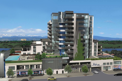
And another mid-sized version from Jetson Green - this time the Beleza: "...a LEED Certified, condo/retail project for Denver's River North ("RiNo") neighborhood. Named , a Brazilian Portuguese word for "beauty", this luxurious green community is modeled after the Brazilian city of Curitiba." Not sure how one models a building after Curitiba - so definitely some more digging to do on this one.


:: image via Jetson Green

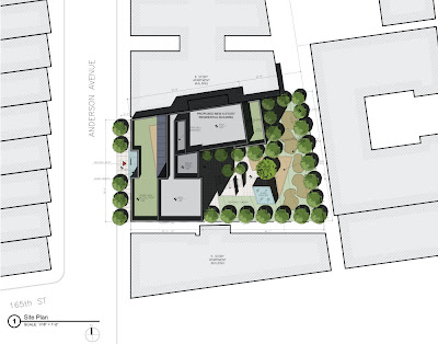
And some graphic examples from World Architecture News - the 1070 Anderson Avenue project by Magnusson Architecture and Planning which brings sustainable and affordable housing to the Bronx - including: "...numerous green initiatives, including green roofs on the 7th and 8th Floors’ setback, a generous fenestration to maximize daylight within the corridors and building envelope..."


:: images via WAN

Finally, a real example - albeit a bit odd, is the mounded grassy knoll on the Freshwater House - via Coolboom... uh, funky?


:: Freshwater House - images via Coolboom

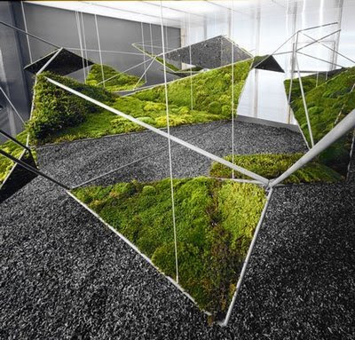
Similar to the 'Fractal Moistscape'? - via Atelier A+D...


:: image via Atelier A+D


__________________

[/LTR]
 

.:taymaz:.

مدیر انجمن‌ها
All eyes on the watchtower

[LTR]
watchtower
2030_rta385.jpg


New RTA Headquarters designed by Zwarts & Jansma Architects

Zwarts & Jansma Architects won the competition for the design of the new headquarters of the Road & Transport Authority (RTA) in Dubai 2007. RTA HQ will be built in an artificial lake at Al Garhoud on Marrakech Road, adjacent to the new Ras Al Khor Bridge and neighbouring the new interchange of Rabat Road and Marrakech Road.
The site is an excellent habitat for the headquarters of an organisation responsible for traffic. RTA HQ will stand as a watchtower overlooking a landscape of infrastructure embedded by the natural beauty of the Dubai Creek and the green zone of Festival City. The crossing of waterways, highways and subways has been a key-factor in the development of both the architectural concept and the landscaping.
RTA HQ is a glass crystal with Venetian blinds. The angled surfaces of the building derive from the site. The reflection of sunlight changes the appearance of the facades during the day. The façade facing the new Ras al Khor Bridge will be covered with a grid of LED-lights: a ‘billboard’ showing images, animations or information to the flow of traffic crossing the creek.
RTA HQ will be built in an artificial lake. During office hours, different features will make the water swirl and turn, in the evening the surface will become quiet. The light-effects then take over, reflecting the building and the city's traffic. The level of the lake is slightly above that of the surrounding area. Underneath it are a publicly accessible exposition space and a congress facility.
Access to the building is provided in three different ways. The congress facility and exposition space are accessible by descending stairs that run over the full length of the northern part of the plot. Staff and employees enter the building through the car park. Taxi drivers drop off visitors on an eye-catching fly-over crossing the artificial lake, right in front of the elevators in the entrance hall.
wol_error.gif
اندازه ی اين عكس تغيير داده شده است. برای ديدن كامل عكس اينجا را كليك كنيد. اندازه ی عكس اصلی 712x1184 است.
2030_1_rta1.jpg
wol_error.gif
اندازه ی اين عكس تغيير داده شده است. برای ديدن كامل عكس اينجا را كليك كنيد. اندازه ی عكس اصلی 712x1183 است.
2030_2_rta2.jpg
wol_error.gif
اندازه ی اين عكس تغيير داده شده است. برای ديدن كامل عكس اينجا را كليك كنيد. اندازه ی عكس اصلی 1000x1667 است.
2030_3_rta3.jpg
wol_error.gif
اندازه ی اين عكس تغيير داده شده است. برای ديدن كامل عكس اينجا را كليك كنيد. اندازه ی عكس اصلی 1000x733 است.
2030_4_rta4.jpg
wol_error.gif
اندازه ی اين عكس تغيير داده شده است. برای ديدن كامل عكس اينجا را كليك كنيد. اندازه ی عكس اصلی 1000x717 است.
2030_5_rta5.jpg
wol_error.gif
اندازه ی اين عكس تغيير داده شده است. برای ديدن كامل عكس اينجا را كليك كنيد. اندازه ی عكس اصلی 1000x740 است.
2030_6_rta6.jpg
[/LTR]​
 

جدیدترین ارسال ها

بالا