hhhhaaaa
Member
سلام به دوستان گلم ")
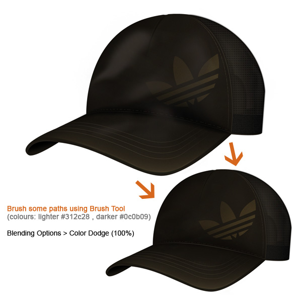
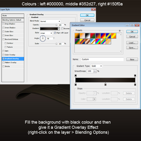
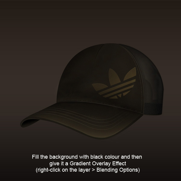
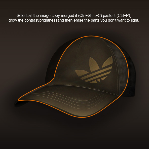
گفتم یه سرچی بکنم تو نت و 10 تا از آموزش های قشنگ فتوشاپ رو بزارم اینجا تا هرکی خواست استفاده کنه
فک نکنم نیازی به ترجمشون باشه ، فتوشاپه دیگه :دی
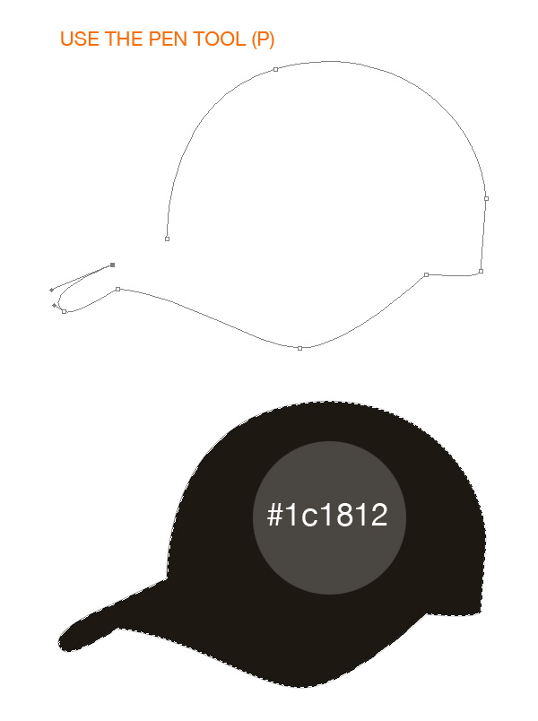
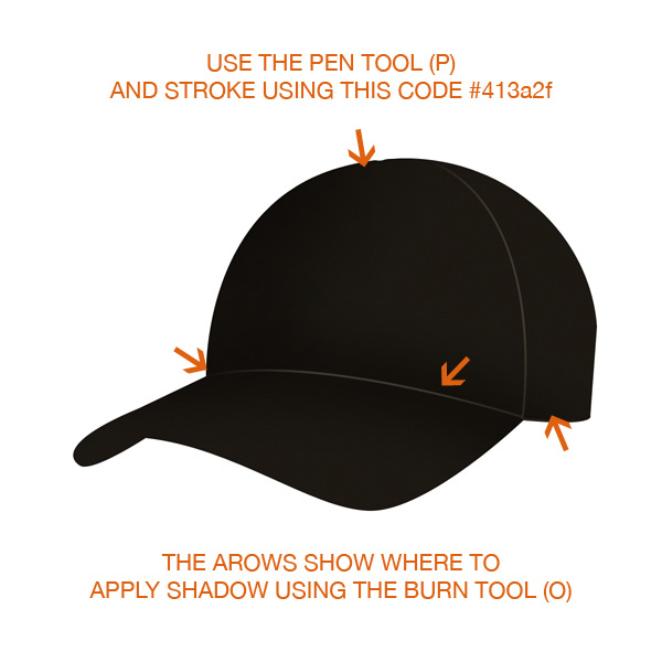
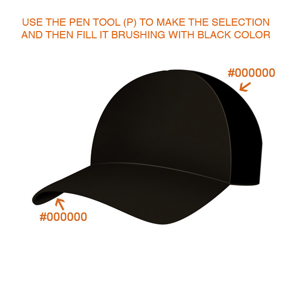
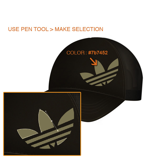
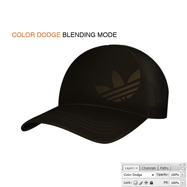
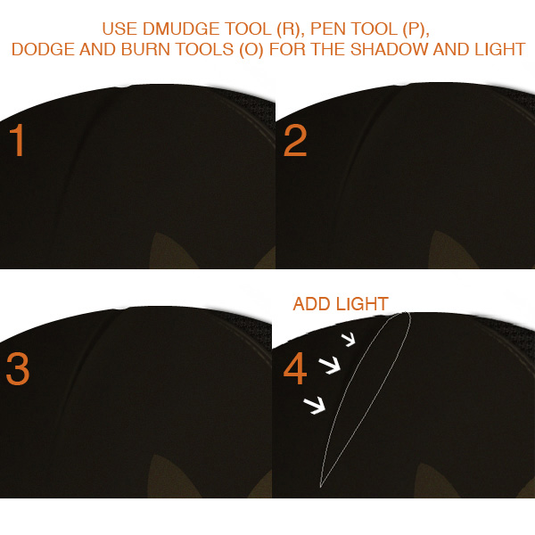
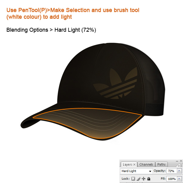
آموزش شماره 1:
گفتم یه سرچی بکنم تو نت و 10 تا از آموزش های قشنگ فتوشاپ رو بزارم اینجا تا هرکی خواست استفاده کنه
فک نکنم نیازی به ترجمشون باشه ، فتوشاپه دیگه :دی
آموزش شماره 1:
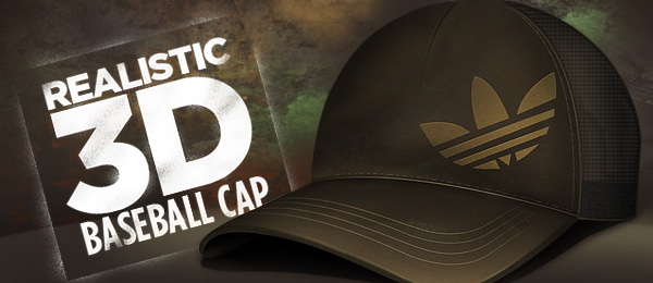
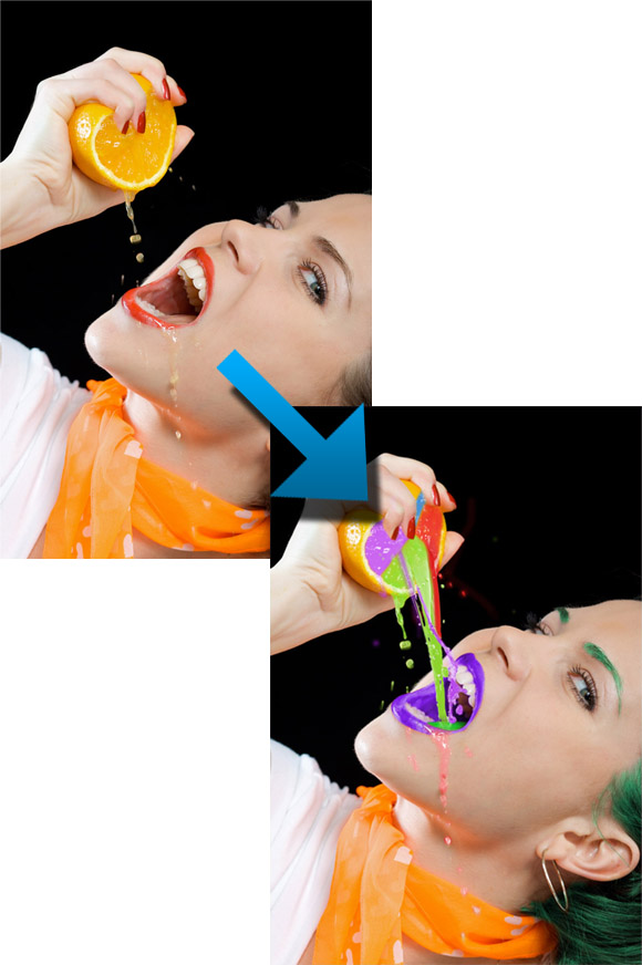
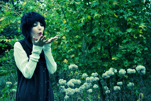
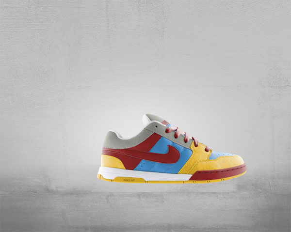
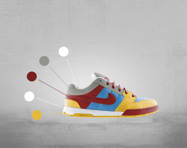
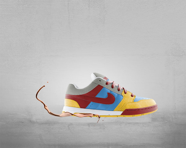
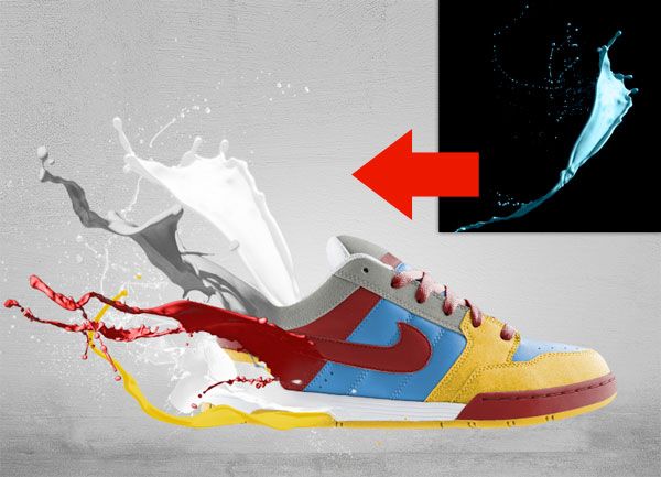
تصویر نهایی

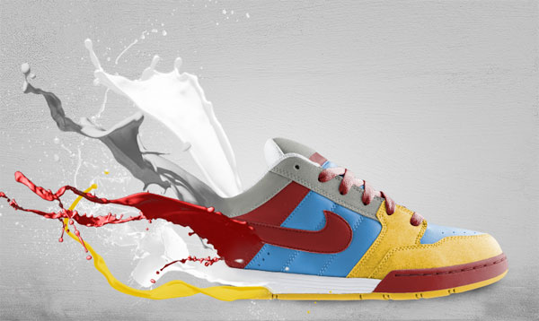
This tutorial is divided into two different parts. The first part, will be a step by step guide on how to create the following brushed explosion:

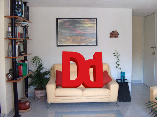
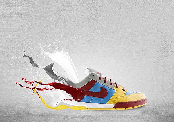
The second part of the tutorial will be a rough guide that will teach you how to create and implement your own 3d text into the explosion and obtain a similar result:

The entire result will be obtained using JUST Photoshop with its default brushes and settings.
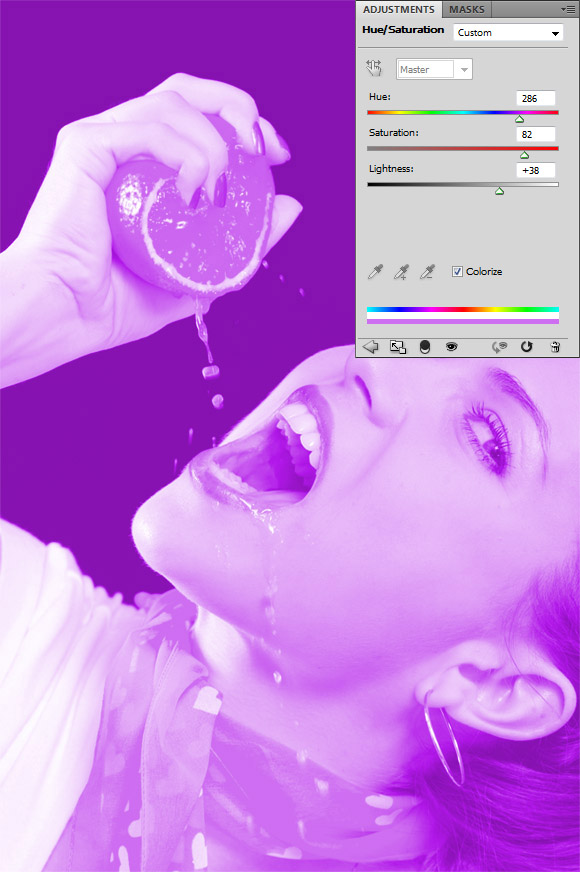
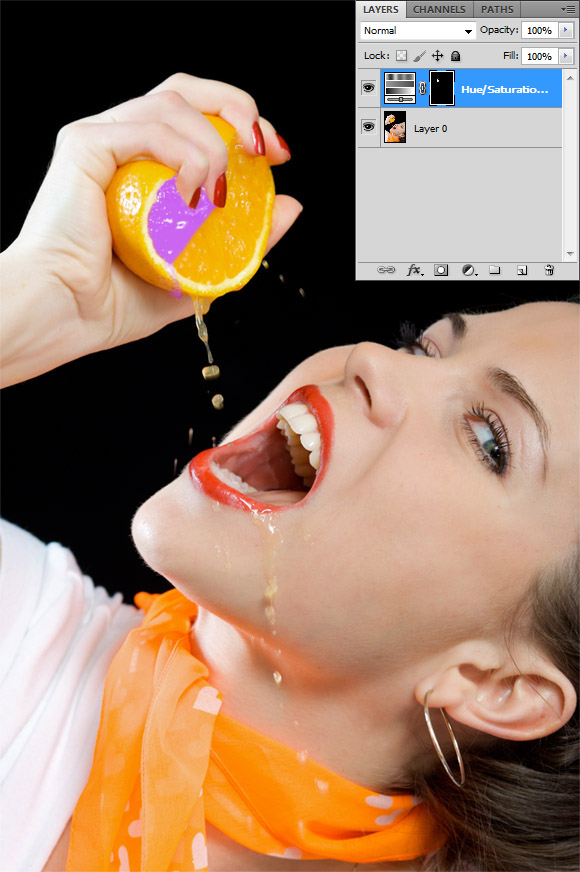
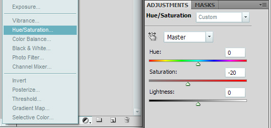
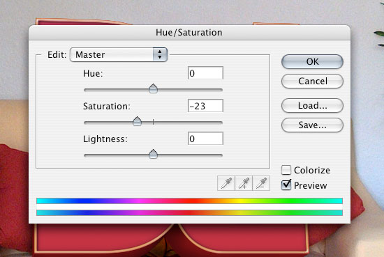
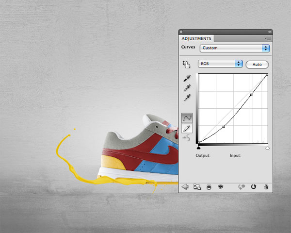
We'll start by creating the background in just a few steps. Create a new document 900x600 px. Reset your colors to black and white by pressing "D" on your keyboard and then click on Filter > Render > Clouds. Afterwards, go to Filter > Stylize > Find Edges and then press CTRL+I to invert your colors. Go to Filter > Add Noise and use 17 for the Amount, Gaussian for the Distribution and check Monochromatic. Afterwards, go to Image > Adjustments > Brightness/Contrast and decrease the Brightness to -70. Press CTRL+U to open the Hue/Saturation window, check the Colorize box and use 270 for Hue and 20 for Saturation. You should have a similar result:

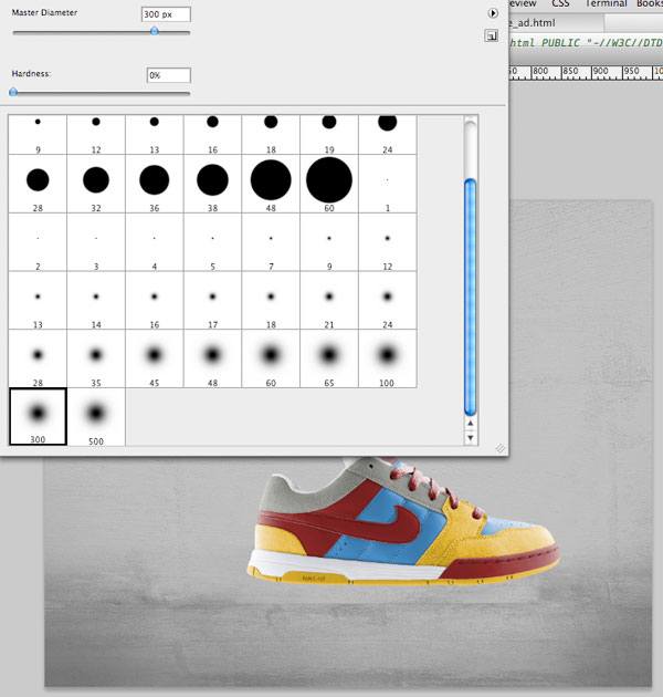
Create a new layer and call it White Explosion. Select the Brush Tool (B), choose the Basic Brushes Set and use a ~ 100px Feathered Brush. Use the color white and draw a shape similar to the one bellow. Select the Smudge Tool (R) and choose a brush from the Thick Heavy Brushes Set (I used the second one). From the center outwards, using the Smudge Tool (R), start dragging until you get a similar result to the one bellow:

Duplicate the White Explosion layer, place it on top and change its name to Yellow Explosion. Right click the layer, choose Blending Options, check Color Overlay and use yellow #ffef3c for your color (instead of the default red), then press Ok. Go to Edit > Free Transform and decrease the size of the Yellow Explosion slightly so that the white explosion behind it looks more like a glow. Using your Eraser Tool (E) and a Feathered Brush ~ 60px click 2-3 times in the center of the yellow explosion randomly to erase some of it. Use the Smudge Tool (R) with the same brush as before and start modifying the Yellow Explosion. There is no right or wrong way to do this just make sure you smudge the yellow explosion both from inside out and outside inwards, in the center where you used your Eraser Tool (E) and on the margins of the explosion. This is my result:

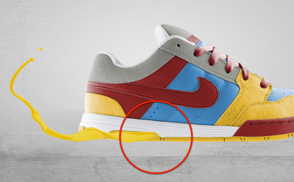
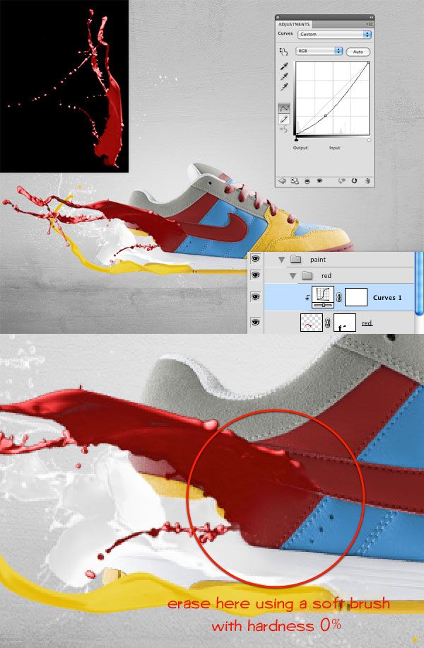
Next we'll be adding the red color to the explosion. Duplicated the Yellow Explosion layer and change its Color in the Blending Options to a darker red #a50000; rename the layer to Red Explosion and place it on top of everything else. Using the Eraser Tool (E) randomly start deleting small spots inside the Red Explosion (6-7 times). Using the Smudge Tool (R) start dragging towards and away from the center of the red explosion to give it some texture and variety. This part of the tutorial is going to be a little tricky and may require you to do a few attempts. One thing to make sure you keep in mind when you're smudging is to make sure you are moving in a straight line either towards or away from the center of your explosion. You can see my result in the first picture bellow. Next, reduce the opacity of the layer "Red Explosion" to 40%. Your image should now look similar to the second screen shot.

Now we'll add more variety to our explosion by creating darker spots. Create a new layer and call it Contrast Points. Using the Brush Tool (B), the color black and a ~ 60px Feathered Brush, place a few random shapes over the explosion. Using the Smudge Tool (R) give the shape a little texture and reduce the layer's Alpha to 65%. Change the Blending Mode of the layer Contrast Points from Normal to Overlay. Feel free to repeat this step several times to add more contrast and detail to your image. You should have a result similar to the second screen shot bellow:

We'll continue with adding more details to the explosion. Create a new layer and call it Explosion Glow. Using the Brush Tool (B) and a 60px Feathered Brush start making a glowing aura on the edge of the explosion. When you're done change the layer's Blending Options to Overlay. You can see in the following example what it will look like with Blending Mode set to Normal and Overlay.

Next, above the background layer and behind all the Explosion layers, create a new layer on which we'll add an orange (#c7500c) glow to contrast the center of the explosion and all of the brush work. Use a Feathered Brush around 100px and start adding orange glows on the sides of the explosion. Your result should be similar to this:

Next, using the Brush Tool (B) and the third Brush from the Thick Heavy Brushes Set we're going to add some particles to the explosion. We'll start by adding white particles behind the explosion first. Create a new layer above the Orange Glow layer and using the Brush Tool (B) click several times randomly right around the edge of the explosion. Next, we'll add the darker particles on top of the explosion. Create a new layer on top of all the other layers, and using the Brush Tool (B) and the color black, start clicking several times to add the particles. Create a new layer and do the same thing, only with the color white this time. Your result should be similar to the following:

To enhance the look of the image try playing with the Alpha of all the particles and also if necessary play with the particles using the Smudge Tool (R). At this point the basic look of your explosion is finished. You can stop here if you'd like or go a little bit further by adding some extra details. In the next step I will show you what extra details I chose to add.
Bellow you will be able to see the final version of the explosion. I am not going to go through each step on how I added each detail since you'll be able to see that by downloading the final source files. I'm simply going to point out what in my opinion were some good additions to the previous step if you decide you want to add more to the image.
-Glows: I decided to make the explosion more colorful so I added a blue and purple glow at the bottom and right side of the explosion. The glows are done using the Brush Tool (B) and setting the layers' Blending Mode to Overlay. At most of the tips of the explosion, on top of everything I added some small faded out orange glows too.
-Focus Point: On Top of all the other layers I added a black circular gradient making the exterior of the explosion darker and the center lighter.
The following is the final version of the simple explosion. Next, I'll be explaining the basics behind how to add your own text on top of the explosion and make it look like it's part of it.
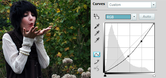
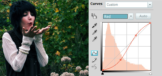
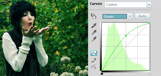
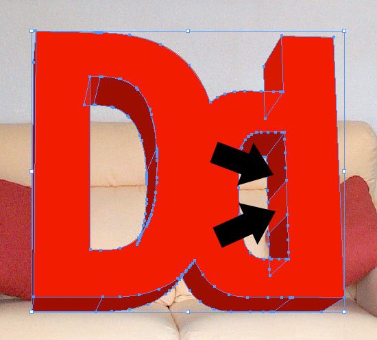
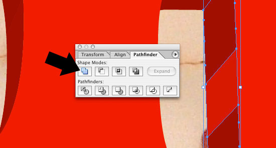
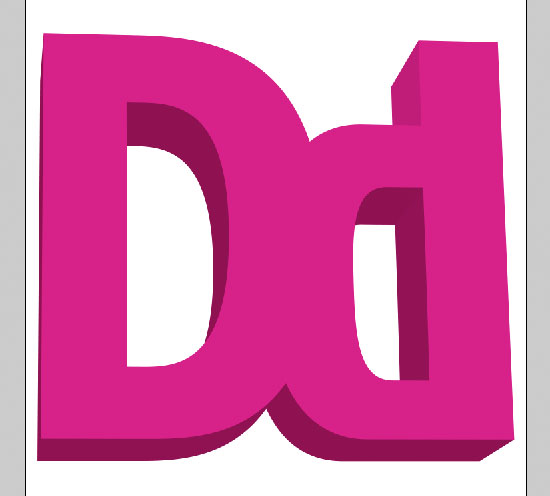
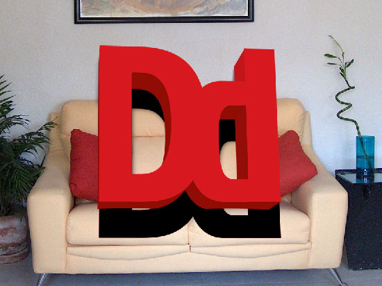
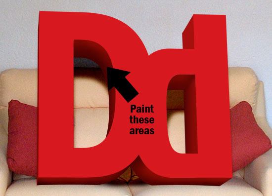
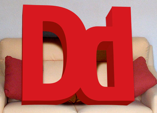
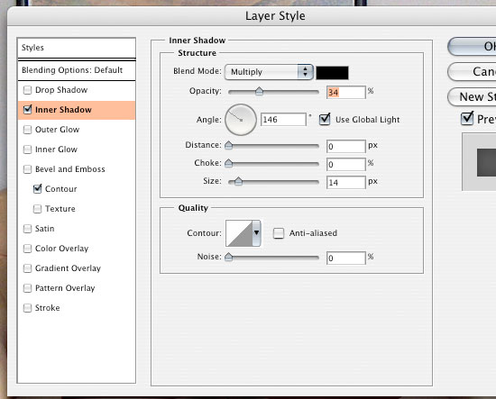
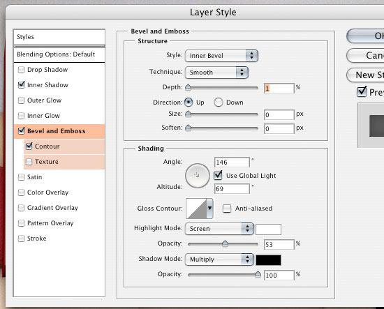
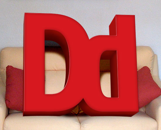
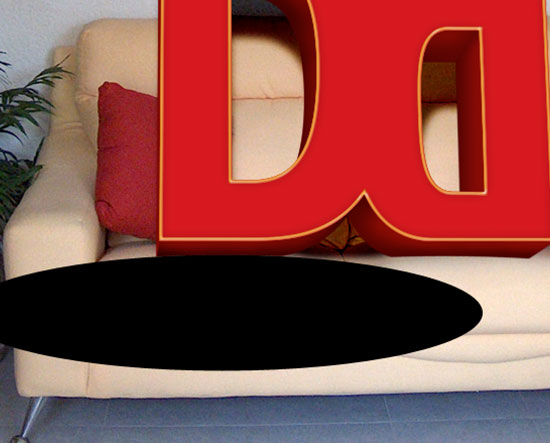
In order to have each letter rotated at a different angle you have to type them individually, each on its own layer. In the next example I'll show you an example on how to make the letter "W" 3D. Start by typing the letter by itself on a new layer. Once you have have the letter created with the desired color and size Rasterise the layer. Next, using the Rectangular Marquee Tool (M) select a portion of your letter, switch back to your Move Tool (V) and then using the arrows on your keyboard or your mouse move that selection to make it look like it broke off the rest of the letter. Once you've done this step multiple times and the letter looks how you want it to look, go to Edit > Free Transform. While holding the CTRL key down start moving the corners of the box that surrounds your shape until your shape looks like its angled 3D. Next, we'll duplicate the layer, place it behind the original layer, change its color in the Blending Options to black and then using your arrow keys we'll move the layer 1px to the right. Then we'll duplicate the black layer and move it 1px to the right again. We'll continue doing this until we have a solid extrude effect. Next, you have to look at your letter's extrude and figure out where to add some gradients to give it a realistic feel. Usually you want those gradients around corners that are not visually distinct in order to make them more obvious. You also want to add those gradients over long continuous extrusions to make it look more realistic. When applying gradients make sure you are using a Foreground to Transparent Gradient and preferably the color white. Bellow you can see a visual representation of the steps just discussed.

Now that you've got all your letters 3D, its time to implement them in the design. Unfortunately, I cant give you a step by step guide on how to do that, because everything is very situational and based on your own results. What I can do however is give you a list of tips and pointers on how to continue on to implementing your text in the explosion. These steps are in no specific order:
- Use the light flare effect. If you look up on google images "light flare effect" you'll see plenty of examples of what I mean. Basically when light goes through a crack or any kind of small area, at its exit it will display a glow over its close surroundings. You can easily do this effect with a Feathered Brush and the color white.
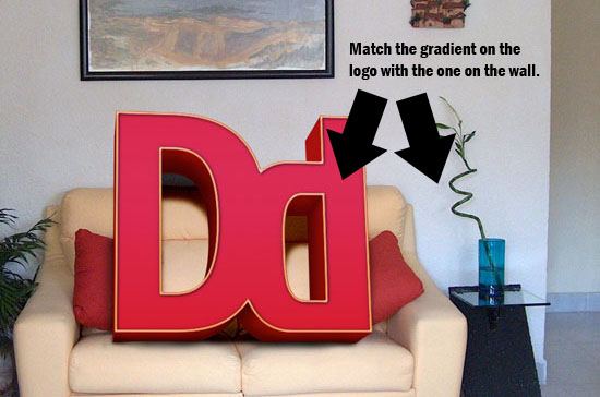
- Implement the background's colors over the text. I chose to decrease the alpha of the extrusion effect to a roughly 80-90% so that the explosion behind it blends in with it. I also took portions of the explosions (after saving the explosion as a JPEG) and placed them over the text at a low alpha to achieve this effect again.
- Add some sort of texture to your text. Simply look up online the desired texture and place it at a lowered alpha over your text in areas where you want it to show. I chose a broken glass texture.
- Add more details to the explosion, more rays, more smudged brushes only this time place them over your text slightly or simply have them interact with it.
- If you're having problems getting a similar result to the one bellow, I strongly suggest you download the .psd so you can get a better understanding on how everything is setup.
- For this design in particular, especially with the background image we're using, sharpen your image at the end! It will increase the quality of the image!
This is what my final product looks like:

This tutorial is divided into two different parts. The first part, will be a step by step guide on how to create the following brushed explosion:
The second part of the tutorial will be a rough guide that will teach you how to create and implement your own 3d text into the explosion and obtain a similar result:
The entire result will be obtained using JUST Photoshop with its default brushes and settings.
We'll start by creating the background in just a few steps. Create a new document 900x600 px. Reset your colors to black and white by pressing "D" on your keyboard and then click on Filter > Render > Clouds. Afterwards, go to Filter > Stylize > Find Edges and then press CTRL+I to invert your colors. Go to Filter > Add Noise and use 17 for the Amount, Gaussian for the Distribution and check Monochromatic. Afterwards, go to Image > Adjustments > Brightness/Contrast and decrease the Brightness to -70. Press CTRL+U to open the Hue/Saturation window, check the Colorize box and use 270 for Hue and 20 for Saturation. You should have a similar result:
Create a new layer and call it White Explosion. Select the Brush Tool (B), choose the Basic Brushes Set and use a ~ 100px Feathered Brush. Use the color white and draw a shape similar to the one bellow. Select the Smudge Tool (R) and choose a brush from the Thick Heavy Brushes Set (I used the second one). From the center outwards, using the Smudge Tool (R), start dragging until you get a similar result to the one bellow:
Duplicate the White Explosion layer, place it on top and change its name to Yellow Explosion. Right click the layer, choose Blending Options, check Color Overlay and use yellow #ffef3c for your color (instead of the default red), then press Ok. Go to Edit > Free Transform and decrease the size of the Yellow Explosion slightly so that the white explosion behind it looks more like a glow. Using your Eraser Tool (E) and a Feathered Brush ~ 60px click 2-3 times in the center of the yellow explosion randomly to erase some of it. Use the Smudge Tool (R) with the same brush as before and start modifying the Yellow Explosion. There is no right or wrong way to do this just make sure you smudge the yellow explosion both from inside out and outside inwards, in the center where you used your Eraser Tool (E) and on the margins of the explosion. This is my result:
Next we'll be adding the red color to the explosion. Duplicated the Yellow Explosion layer and change its Color in the Blending Options to a darker red #a50000; rename the layer to Red Explosion and place it on top of everything else. Using the Eraser Tool (E) randomly start deleting small spots inside the Red Explosion (6-7 times). Using the Smudge Tool (R) start dragging towards and away from the center of the red explosion to give it some texture and variety. This part of the tutorial is going to be a little tricky and may require you to do a few attempts. One thing to make sure you keep in mind when you're smudging is to make sure you are moving in a straight line either towards or away from the center of your explosion. You can see my result in the first picture bellow. Next, reduce the opacity of the layer "Red Explosion" to 40%. Your image should now look similar to the second screen shot.
Now we'll add more variety to our explosion by creating darker spots. Create a new layer and call it Contrast Points. Using the Brush Tool (B), the color black and a ~ 60px Feathered Brush, place a few random shapes over the explosion. Using the Smudge Tool (R) give the shape a little texture and reduce the layer's Alpha to 65%. Change the Blending Mode of the layer Contrast Points from Normal to Overlay. Feel free to repeat this step several times to add more contrast and detail to your image. You should have a result similar to the second screen shot bellow:
We'll continue with adding more details to the explosion. Create a new layer and call it Explosion Glow. Using the Brush Tool (B) and a 60px Feathered Brush start making a glowing aura on the edge of the explosion. When you're done change the layer's Blending Options to Overlay. You can see in the following example what it will look like with Blending Mode set to Normal and Overlay.
Next, above the background layer and behind all the Explosion layers, create a new layer on which we'll add an orange (#c7500c) glow to contrast the center of the explosion and all of the brush work. Use a Feathered Brush around 100px and start adding orange glows on the sides of the explosion. Your result should be similar to this:
Next, using the Brush Tool (B) and the third Brush from the Thick Heavy Brushes Set we're going to add some particles to the explosion. We'll start by adding white particles behind the explosion first. Create a new layer above the Orange Glow layer and using the Brush Tool (B) click several times randomly right around the edge of the explosion. Next, we'll add the darker particles on top of the explosion. Create a new layer on top of all the other layers, and using the Brush Tool (B) and the color black, start clicking several times to add the particles. Create a new layer and do the same thing, only with the color white this time. Your result should be similar to the following:
To enhance the look of the image try playing with the Alpha of all the particles and also if necessary play with the particles using the Smudge Tool (R). At this point the basic look of your explosion is finished. You can stop here if you'd like or go a little bit further by adding some extra details. In the next step I will show you what extra details I chose to add.
Bellow you will be able to see the final version of the explosion. I am not going to go through each step on how I added each detail since you'll be able to see that by downloading the final source files. I'm simply going to point out what in my opinion were some good additions to the previous step if you decide you want to add more to the image.
-Glows: I decided to make the explosion more colorful so I added a blue and purple glow at the bottom and right side of the explosion. The glows are done using the Brush Tool (B) and setting the layers' Blending Mode to Overlay. At most of the tips of the explosion, on top of everything I added some small faded out orange glows too.
-Focus Point: On Top of all the other layers I added a black circular gradient making the exterior of the explosion darker and the center lighter.
The following is the final version of the simple explosion. Next, I'll be explaining the basics behind how to add your own text on top of the explosion and make it look like it's part of it.
In order to have each letter rotated at a different angle you have to type them individually, each on its own layer. In the next example I'll show you an example on how to make the letter "W" 3D. Start by typing the letter by itself on a new layer. Once you have have the letter created with the desired color and size Rasterise the layer. Next, using the Rectangular Marquee Tool (M) select a portion of your letter, switch back to your Move Tool (V) and then using the arrows on your keyboard or your mouse move that selection to make it look like it broke off the rest of the letter. Once you've done this step multiple times and the letter looks how you want it to look, go to Edit > Free Transform. While holding the CTRL key down start moving the corners of the box that surrounds your shape until your shape looks like its angled 3D. Next, we'll duplicate the layer, place it behind the original layer, change its color in the Blending Options to black and then using your arrow keys we'll move the layer 1px to the right. Then we'll duplicate the black layer and move it 1px to the right again. We'll continue doing this until we have a solid extrude effect. Next, you have to look at your letter's extrude and figure out where to add some gradients to give it a realistic feel. Usually you want those gradients around corners that are not visually distinct in order to make them more obvious. You also want to add those gradients over long continuous extrusions to make it look more realistic. When applying gradients make sure you are using a Foreground to Transparent Gradient and preferably the color white. Bellow you can see a visual representation of the steps just discussed.
Now that you've got all your letters 3D, its time to implement them in the design. Unfortunately, I cant give you a step by step guide on how to do that, because everything is very situational and based on your own results. What I can do however is give you a list of tips and pointers on how to continue on to implementing your text in the explosion. These steps are in no specific order:
- Use the light flare effect. If you look up on google images "light flare effect" you'll see plenty of examples of what I mean. Basically when light goes through a crack or any kind of small area, at its exit it will display a glow over its close surroundings. You can easily do this effect with a Feathered Brush and the color white.
- Implement the background's colors over the text. I chose to decrease the alpha of the extrusion effect to a roughly 80-90% so that the explosion behind it blends in with it. I also took portions of the explosions (after saving the explosion as a JPEG) and placed them over the text at a low alpha to achieve this effect again.
- Add some sort of texture to your text. Simply look up online the desired texture and place it at a lowered alpha over your text in areas where you want it to show. I chose a broken glass texture.
- Add more details to the explosion, more rays, more smudged brushes only this time place them over your text slightly or simply have them interact with it.
- If you're having problems getting a similar result to the one bellow, I strongly suggest you download the .psd so you can get a better understanding on how everything is setup.
- For this design in particular, especially with the background image we're using, sharpen your image at the end! It will increase the quality of the image!
This is what my final product looks like:
کد:
[URL="http://www.webdtools.com/design/graphics/brushed_explosion/source_final.zip"]دانلود سورس آموزش[/URL]